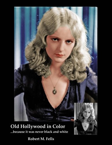
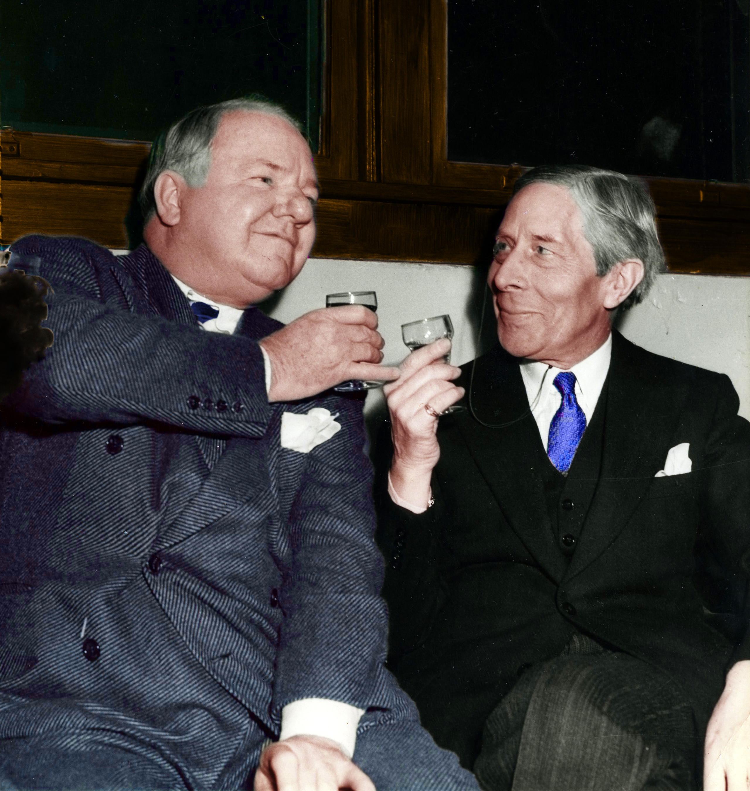
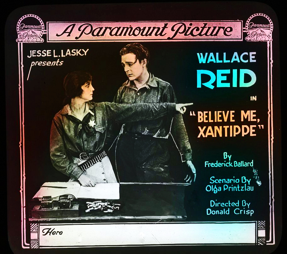
This blog is more or less a companion site to the Arliss Archives, which is a celebration of actor, author, playwright and film maker George Arliss (1868-1946). As the Arliss site evolved, I found that adding digital color to original black & white photographs sometimes produced startlingly good results. More importantly, the “cinemagraphic painting process” as I call it, brought a contemporary quality to these visions of long ago. Some black and white photos were obviously designed to exploit the beauty of light and shadows and those works I have preserved in their original greytones as the photographer intended.
Purists may contest this point, but the fact is that most studio photographs from old Hollywood used black and white film in a utilitarian manner because color film was either too expensive or unavailable. The studios themselves routinely converted B&W photos into color posters, lobby cards, and even colorized glass slides projected onto movie screens. So historically there is a long tradition of adding color to these images and we lose nothing by using 21st century processing techniques to render these wonderful vintage photographs into the spectrum. Instead, we gain an insight into that Golden Age to see the world just as the people who lived back then saw it. For example…..
One of my favorites – Al Jolson. Here is an original photo taken during his 1930 film, MAMMY. The black and white photography is not especially artistic:

Turning this photo into color involves a number of judgment calls. Not only the choice of colors to apply, but their shade and intensity. Another judgment call: what not to color, which can be as important as deciding what to color. The point is this: if we were standing next to the camera, which of these two photos comes closer to what we would have seen?

Another favorite – John Barrymore. This portrait from his first talkie, GENERAL CRACK (1930), is carefully composed after the style of late 18th century paintings. The most obvious difference is that this photo is black and white:

Whereas the portraits that inspired the photo were painted in color:

At any rate, this explains the rationale behind this site. Of course, we will be including original color material as well as our digital creations. If you’d like to see more, then please subscribe at the link on the right column here. Our first post is planned for launch in late July as an anniversary tribute to the legendary Rudolph Valentino so please don’t miss it. Thanks.


")


Wonderful idea but I’d scale the color intensity down maybe 25% to give it a more realistic look. Right now it’s very cartoony. Anyway, just an opinion. Glad you’re doing this.
Thanks, Barry. I appreciate the feedback and constructive criticism is always welcomed. I tend to agree with you about the color intensity and will modify it. Basically I’m inspired by old lobby cards that WERE intense color-wise but I’m starting to realize that’s not a good model to base my work on. These photos do come across as “too cartoony” which is not the impression I’m trying to make. Thanks again.
Bob
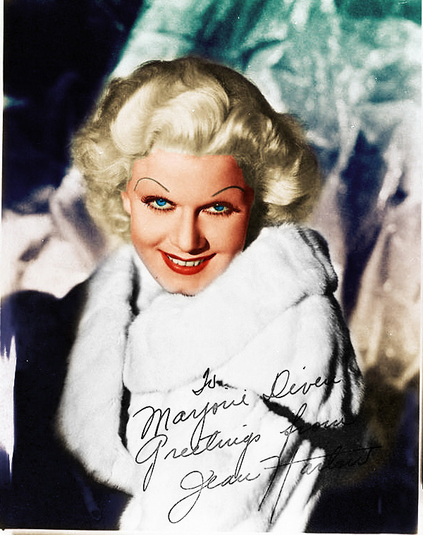
I have agree. Perhaps a *tad* cartoony but I don’t think you need to dial it down 25%. I’d say more like 15 to 20%. Did you hand tint the photo of Harry Carey with Betty Field? If you did, that’s a GREAT job! That detail aside, I love your site and intend to come back often. And I’ve added a link from my site too.
All the best,
Martin Turnbull
The Harry Carey/Betty Field photo is an original color photo that I merely gave a digital boost. There are a few “real” color pix in the right hand column. I’ll be visiting your website so thanks for the link.
Hi Bob!
Glad you didn’t mind my input! I’m sure you’ll be tweaking photos for awhile to get the must quasi-natural look. I work with color balancing and correction in video and it’s always a matter of dialing up and
down and sideways before it looks “comfortable.” The hybrid Carey photo is about as vivid as it should get if you desire any kind of “you are there” realism. Otherwise it looks like fantasy imagery rather than capturing a more documentary “wow, it looks like it was taken yesterday!” feel. My two cents. 😀
Just a question about a statement in the Lon Chaney section:
“The old story of how Universal wanted Lon for DRACULA (1931) has been discredited but then Universal didn’t want Bela Lugosi either. ”
This was news to me; I’ve read several books on Lon Chaney Sr. including one I own by Michael Blake – but I don’t recall ever hearing that this story regarding the casting of Dracula has been “discredited”. I find it particulary interesting considering that Tod Browning was the director, and his work history with Chaney is of course well-documented; plus Browning still had a pretty good reputation as this came before “Freaks”.
Would you please share with me your source(s) for this information? When, where, and by whom was it discredited that Universal didn’t want Chaney for Dracula?
Thank you so much (love the pictures, btw),
Missy
Louisville, KY
Excellent inquiry, Missy. Thank you. Michael Blake has written three Chaney books and this info is in his second or third volume. Also, a detailed account of Universal’s efforts to cast the lead in DRACULA can be found in HOLLYWOOD GOTHIC by David J. Skal. Long story short – Conrad Veidt was Universal’s announced star until he decided to return to Germany. The film would have been directed by Paul Leni but he died suddenly in ’29, precipitating Veidt’s decision to leave Hollywood. Chaney was ailing by May ’29 and unable to work. MGM suspended him in Sept ’29. He finally reported for THE UNHOLY THREE in April 1930 but learned by the end of that month that he had lung cancer. His remaining four months were spent battling the cancer. I don’t say that Universal didn’t want to cast Chaney but the sequence of events indicate that he was not seriously considered.