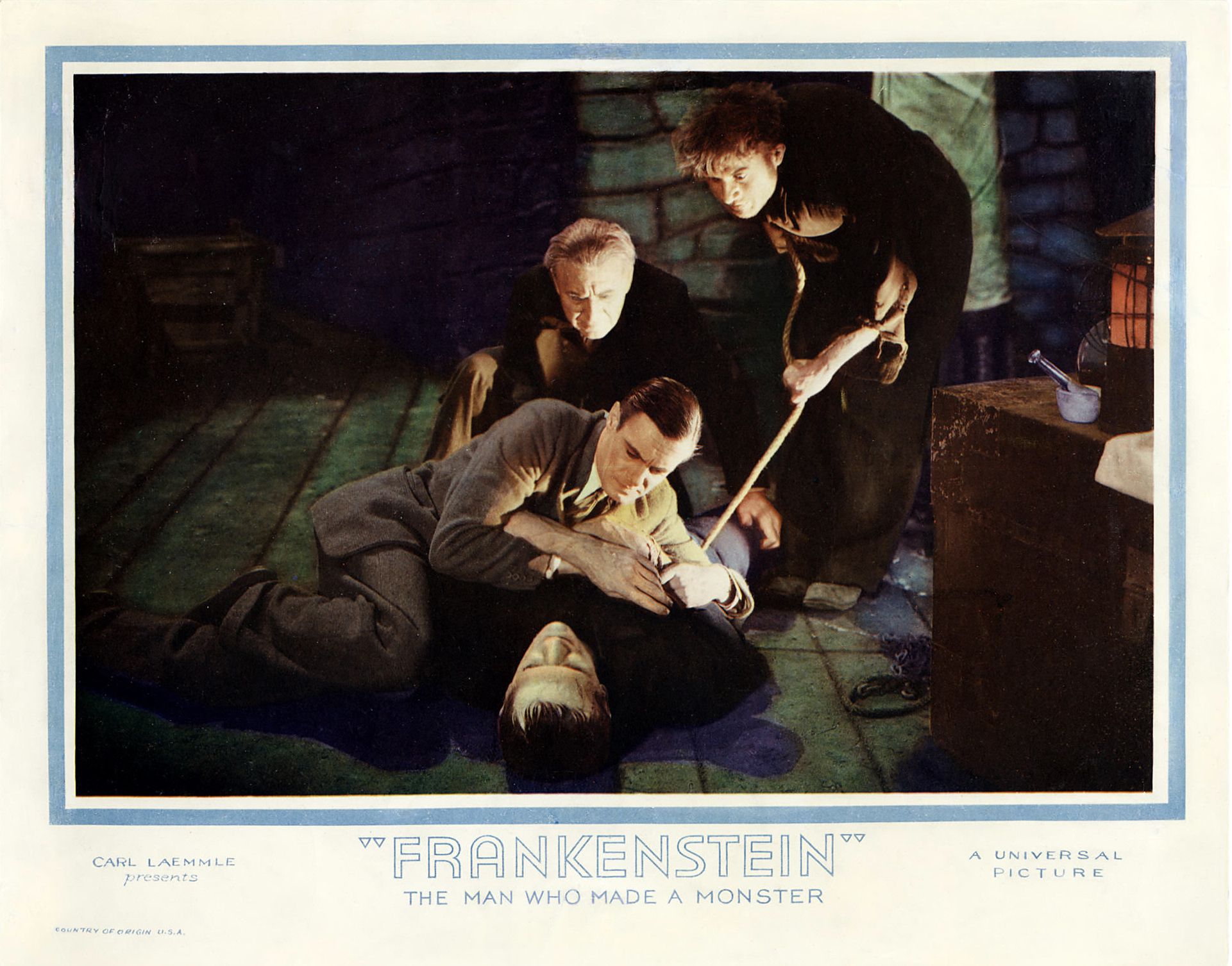
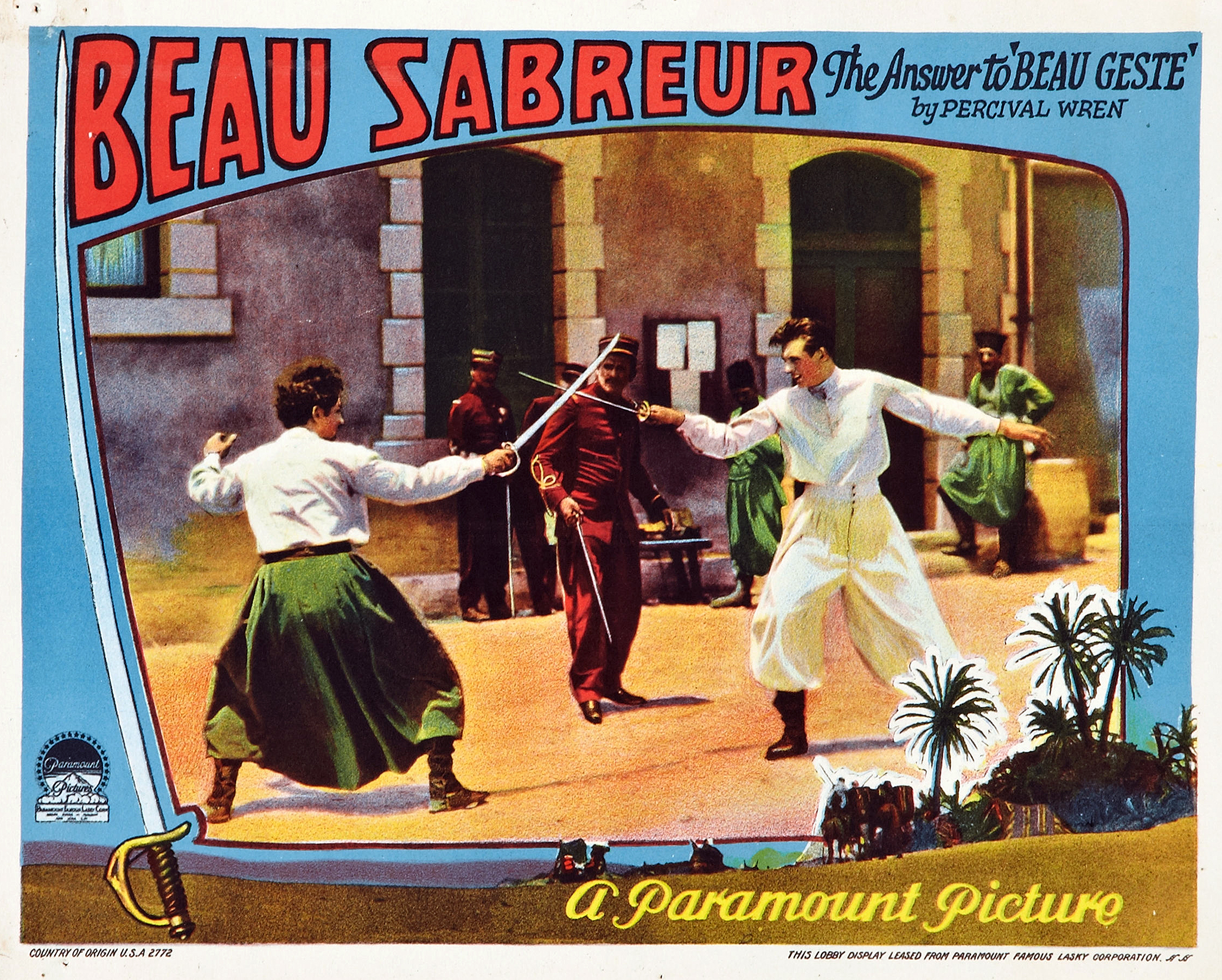
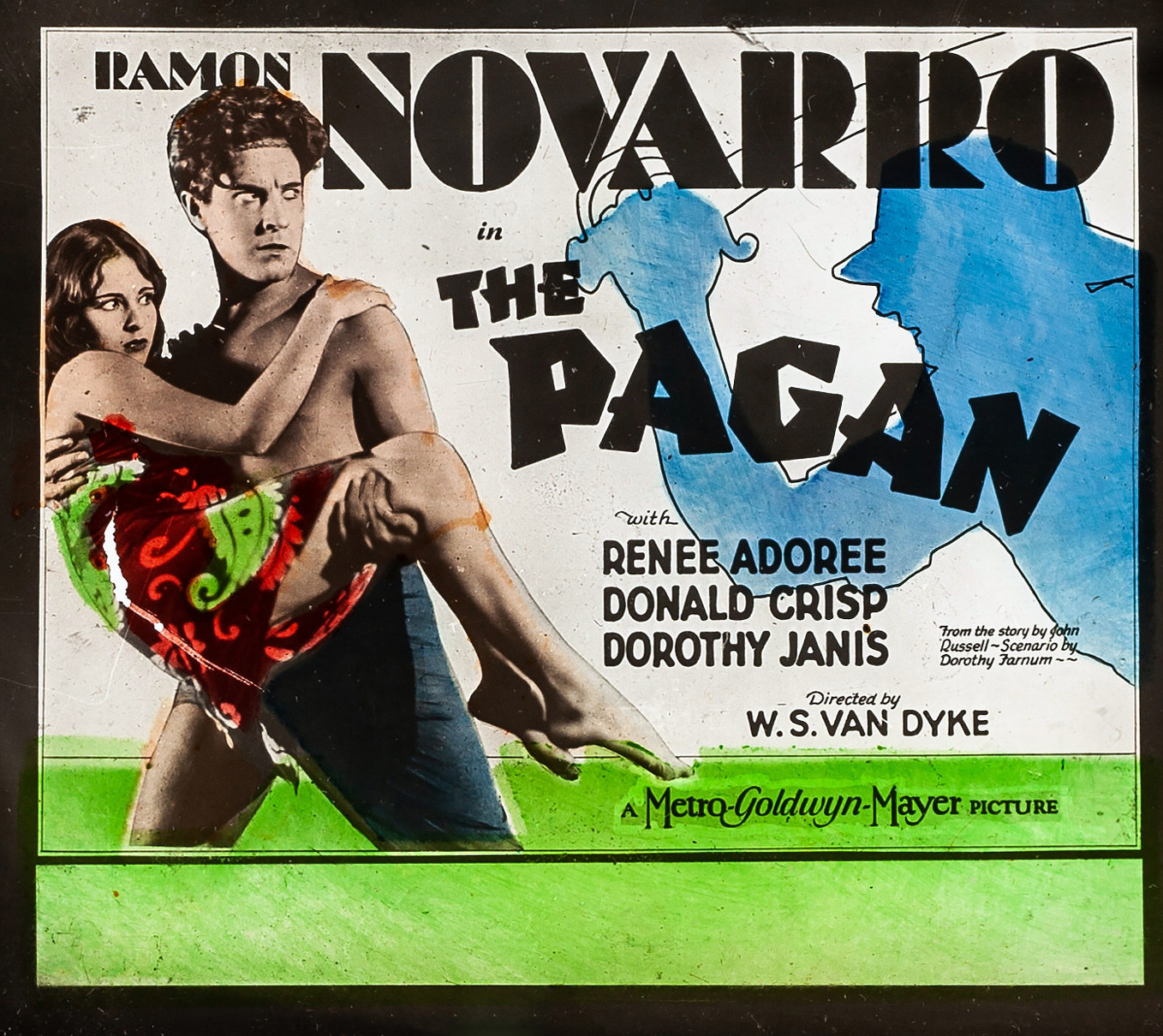
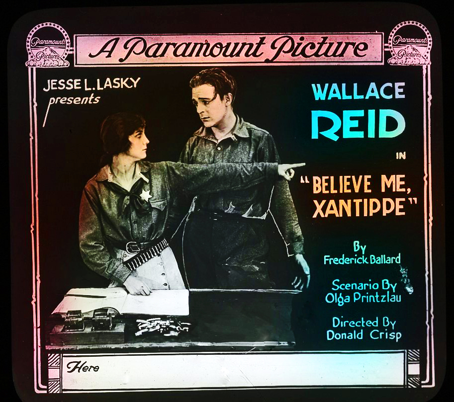
If you like what you see, click on the image and then print it out.


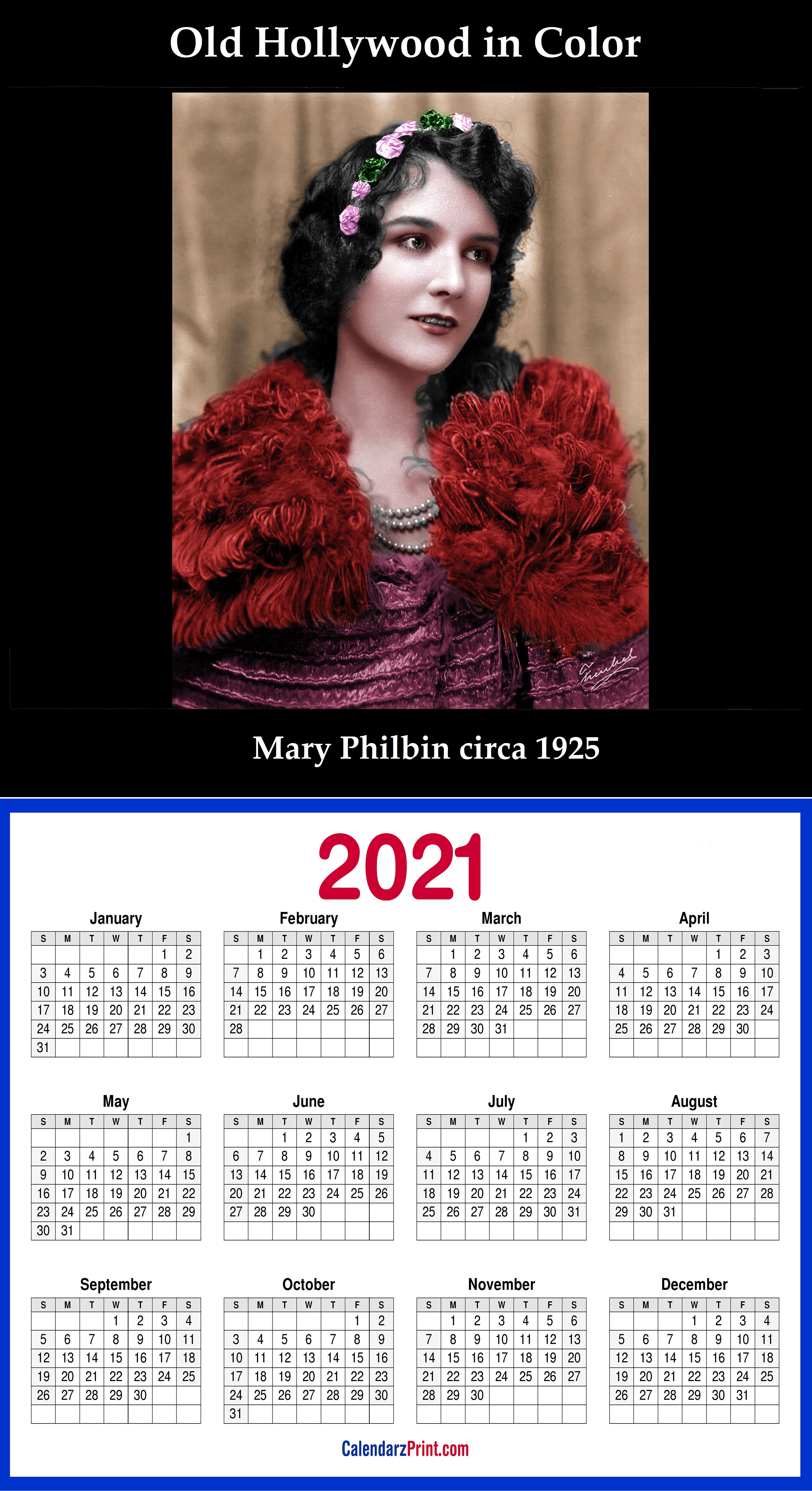

HAPPY NEW YEAR to One and All!
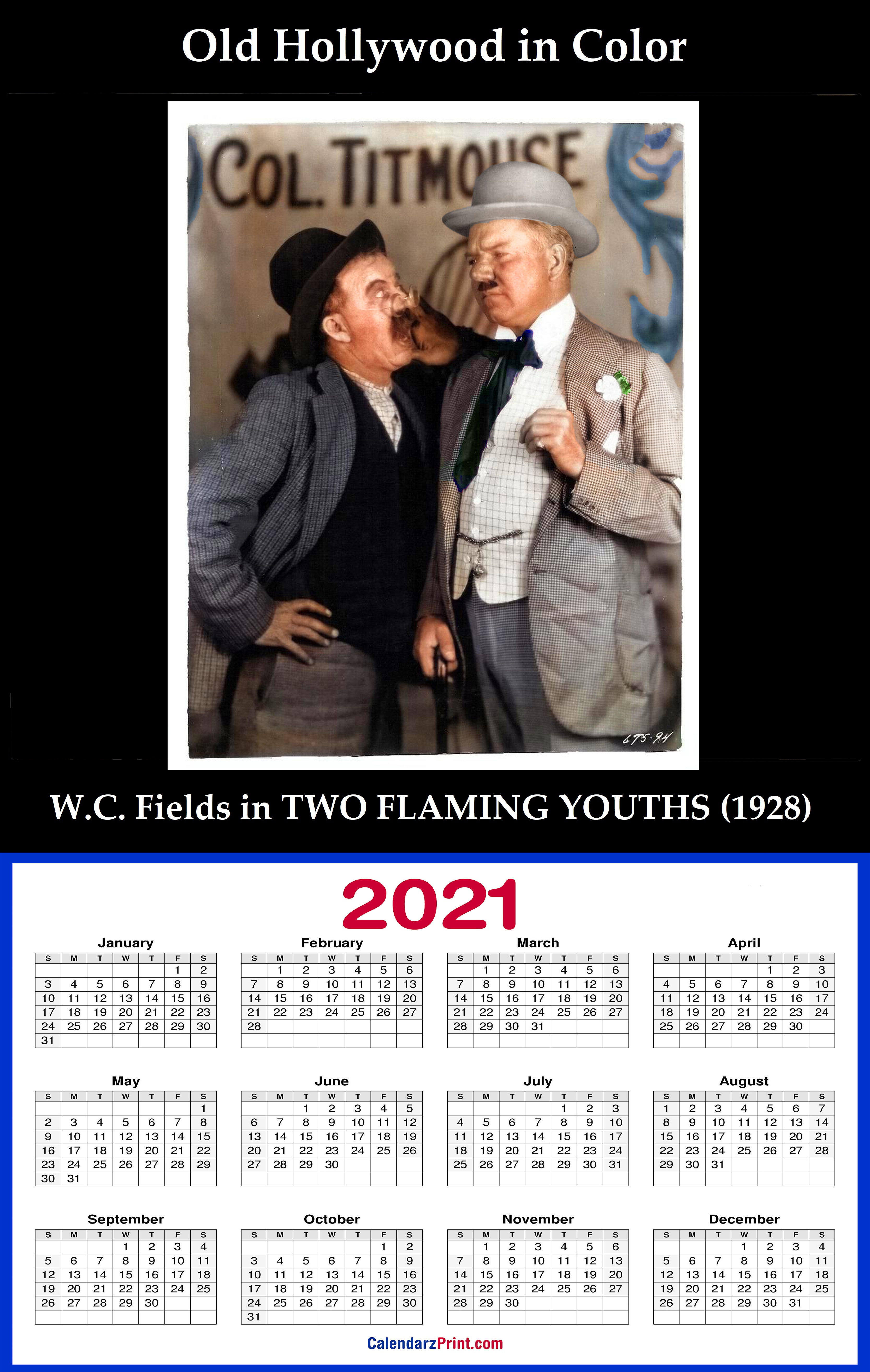
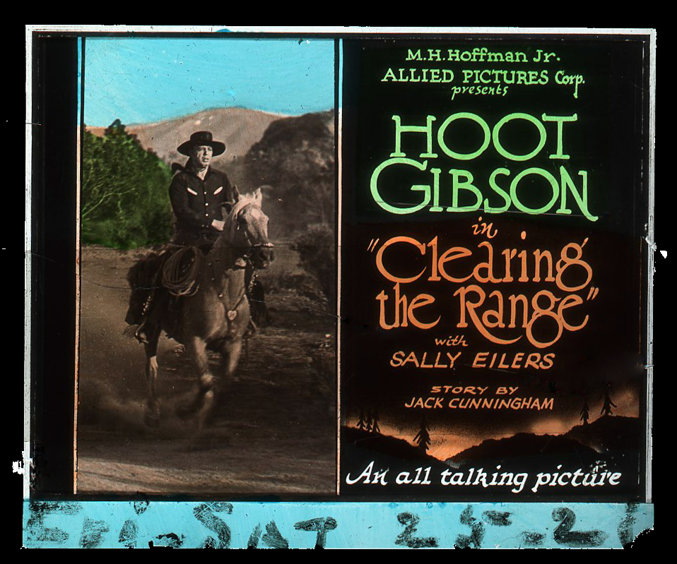
If you like what you see, click on the image and then print it out.
HAPPY NEW YEAR to One and All!
The URI to TrackBack this entry is: https://oldhollywoodincolor.com/2020/12/31/our-new-lineup-of-calendars-for-2021/trackback/


")


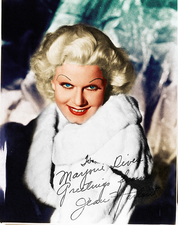


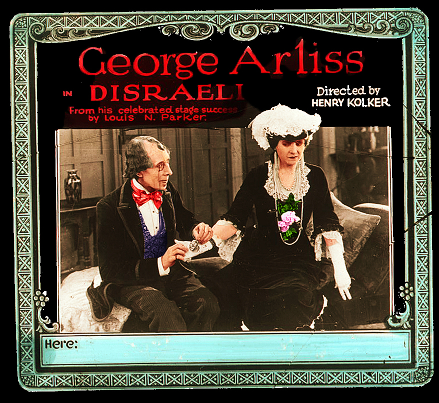


marvelous collection… like the Arliss one the best
Great stuff!!!!
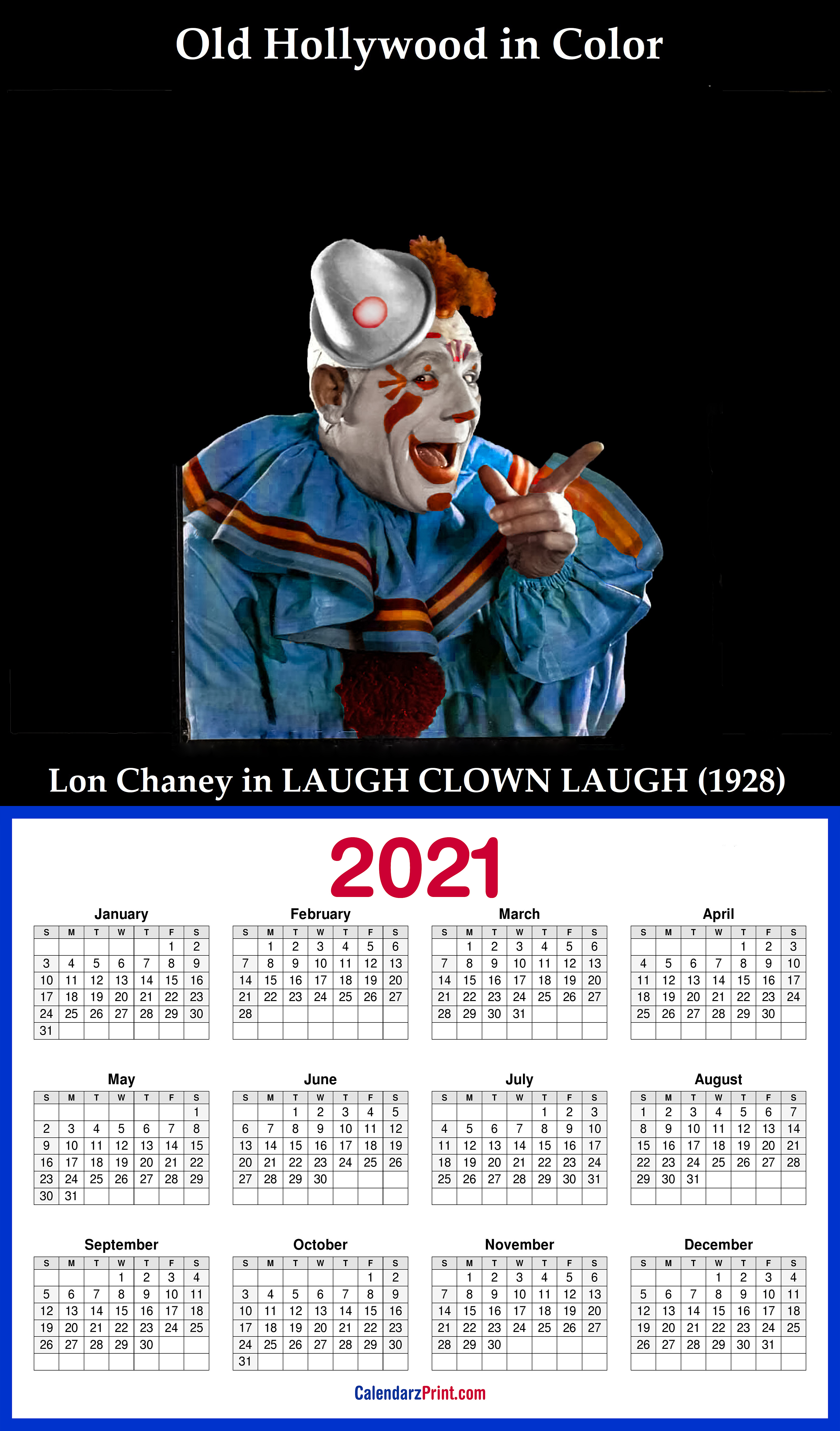
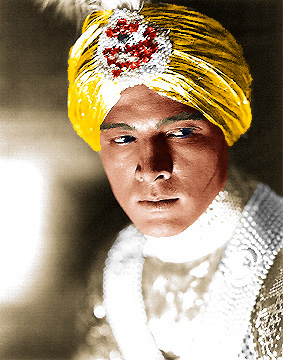
Hi! Very nice colorization work! One thing I’m curious about is whether or not these colors are “accurate” (in the sense that they are based on the actual colors of the clothing). For example, if a dress is blue in your colorization, was this color chosen because the dress was blue in real life? Or, from an example above, was Lon Chaney’s costume in “Laugh, Clown, Laugh” really blue and orange? Do you research to find out what the colors really were? Thank you!
Hello Andrea, you ask some very good questions. The answer is “it depends.” Most colorists will review authentic color photos or films from the 1920s or 30s and even compare b/w versions of the same photo. For example, navy blue would look dark gray in b/w whereas light blue would look light gray. Also, some popular colors in clothing back then are rarely seen in today’s fashions. For example, men’s suits were in various shades of green back in the day. So coloring a b/w photo of a man in a light gray suit you could consider a light blue or a light green or simply light gray. It’s important not to try to color everything. Just as in nature, some things are white or black or a shade of gray. Skin tones can be a real challenge but I find that using “lipstick” in Photoshop gives a nice general skin tone that can be adjusted one way or the other. For women wearing lipstick, adding a second layer of “lipstick” over the first one on the lips gives an appealing ruby red effect. These can all be dialed down to suit the colorist..
I think it’s important not to be too slavish to follow what the colors might have been. The palate created by the colorist for each photo is what’s important, not whether the jacket really was a light blue or green or brown, etc. The colors chosen should work together. Finally, let me tell you what happens when a colorist insists on being “authentic.” In the 1938 film, JEZEBEL with Bette Davis, she famously wore a ruby red gown that caused a scandal at the ball. But the film was made in b/w and the red dress photographed as black. That would confuse the audience so they experimented to find a color that people would think was red. Ironically, they discovered that black was perfect. It photographed as a gray suggesting red. OK, here’s the question: if I’m colorizing a photo of Bette Davis in that dress do I make it red as it was meant to be regarded (it was an important story point) or do I make it black because that was really its color? I’d opt for red as the filmmakers’ intention. This is why judgment is important. Bob
Hello! Thank you very much for your thoughtful reply! I didn’t consider the possibility of “actual” costume colors being tweaked to appear a different color in black and white (such as the case of Bette Davis’ down). I think your color choices have a good sense of harmony and realism. I was chiefly curious because I’m a paper doll artist and one of my current projects is a Lon Chaney paper doll. I had considered the idea of designing the whole set in black and white (perhaps with grey and maybe a few neutral creams/etc. as accents) because I’m not sure what color most of his costumes were, or were intended to be. That’s why I asked! I’ll probably end up experimenting and see what looks best. Again, thank you for your reply!
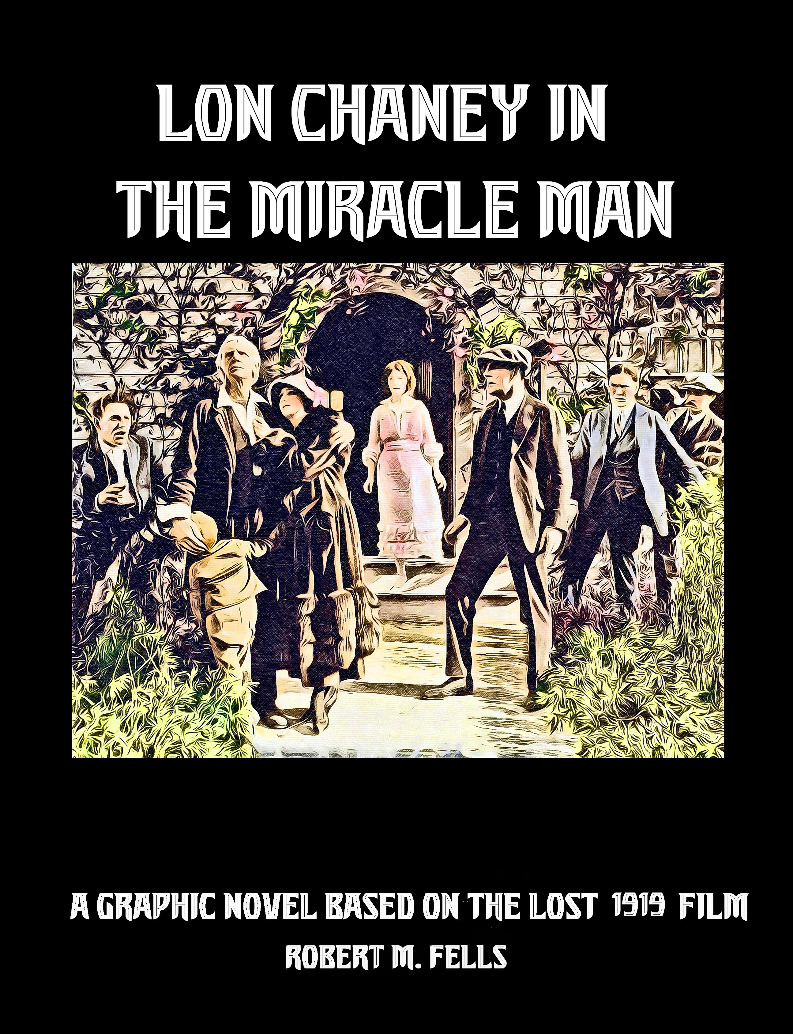
Andrea, if you want to see many colorized Lon Chaney photos I suggest you join our Facebook group called Lon Chaney – Man of 1,000 Faces. There are other Chaney FB groups so be sure to use the exact title or heavens knows where you’ll wind up. Our members, about 1.5K, would be interested in learning about your Chaney paper doll. I published a graphic novel of Lon’s lost film, THE MIRACLE MAN. Lon did make one Technicolor appearance in PHANTOM OF THE OPERA. That’s on our group too. Bob
Thank you, I’ll be sure to check that out! Most of my work is of literary and religious figures (for example, one of my early projects was a “Heidi” paper doll set and another was a set illustrating the youth of St. Therese of Lisieux) but I’ve been a fan of Lon Chaney for years, and Paperdoll Review, which produces a themed paper doll magazine a couple of times a year, is having a “The Silent Screen” theme in the next few months, so I thought it was the perfect opportunity to combine my love of paper dolls with my admiration for this talented actor. If you’d like to see any of my work, I have an Instagram page (@stellamarigoldart) and Paperdoll Review published a few of my books recently. In this case, I’d have to look into copyright laws to see if it would be possible to publish a book if I make enough costumes/pages (I haven’t made any “celebrity” paper dolls before so I’m not sure how that works) but regardless I could still share the pages with your FB group for fun (and I’m doing this for fun in the first place anyway!). Thank you again for your help – it is so kind of you to offer this assistance 🙂 And I’ll make sure to look up your graphic novel – what an interesting idea!